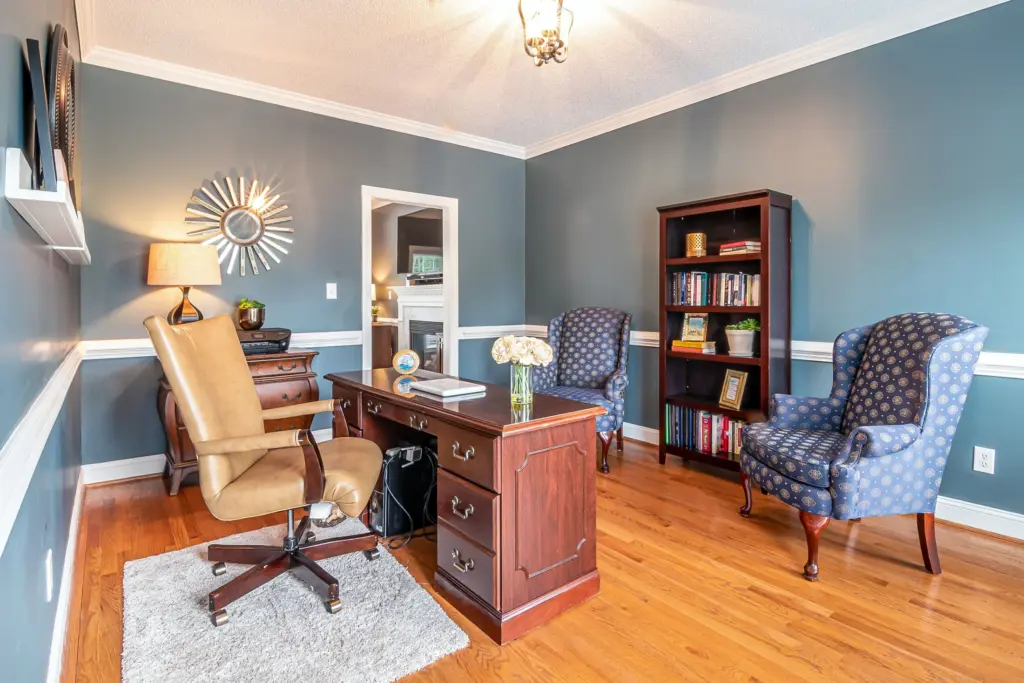
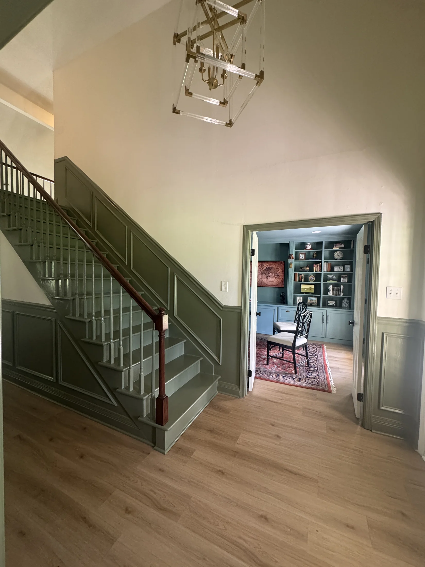
A whole-house paint color palette does not mean every room gets the same beige. It means the home feels connected as you move through it. One room can be warm and restorative, another can be bright and social, and a powder room can have real personality—all without creating the feeling that each door opens into a different house.
The secret is to make a few foundational decisions before you fall in love with individual colors. Start with the elements you cannot easily change. Establish a small group of reliable neutrals. Then use color where it adds something to the way you live.
If your project includes more than one room, an residential interior painting service estimate is a good time to discuss the palette as a complete plan, not a series of disconnected choices.
Start with the home’s fixed finishes
Paint is flexible. Flooring, countertops, tile, stone, cabinetry, upholstery, and wood tones are not nearly as flexible. Those materials should be the first references for a cohesive interior color scheme.
Walk through the home with a notebook and list:
- dominant floor color and undertones
- cabinet and countertop colors
- tile in baths and laundry areas
- fireplace brick or stone
- the amount and direction of natural light
- furnishings you plan to keep
- trim color and any stained woodwork
Undertones are especially important. A gray floor may lean blue, green, purple, or warm brown. A “white” countertop may read creamy or cool. A paint color can be beautiful by itself and still feel wrong beside a fixed finish if their undertones compete.
Find the connecting thread
Most successful homes have one or two quiet threads that recur. It may be a warm white trim used throughout. It may be earthy undertones that echo the wood floors. It may be a soft green that appears in a bedroom, an art piece, and a small accent in the living room.
The thread does not have to be obvious. Its job is to create continuity in the background, so individual rooms have room to breathe.
Choose a simple palette structure
A practical whole-home plan often has three layers:
| Palette layer | Purpose | Example approach |
|---|---|---|
| Foundation neutral | Connects main spaces | One warm white, pale greige, soft gray, or muted beige for halls and shared areas |
| Supporting neutrals | Add gentle variation | A deeper neutral for a den or a lighter one for a bright bedroom |
| Accent colors | Give selected rooms identity | Blue-green in a bedroom, earthy clay in a dining room, deeper color in a powder room |
You do not need a dozen wall colors. In many homes, one foundation neutral, two supporting colors, and one or two accents are plenty. The palette becomes more flexible when the colors share a similar temperature or level of softness.
For example, a warm white in the main circulation areas, a pale mushroom in the primary bedroom, a dusty blue-green in a guest room, and a muted terracotta in the powder room can all work together when the trim and wood tones are consistent. The colors differ, but they belong to the same visual conversation.
Decide how much contrast you want
Color flow is not only about hue. It is also about contrast: how light or dark a room feels relative to the spaces around it.
If you want an airy, continuous effect, keep adjoining rooms close in value. You can shift from a creamy off-white to a pale warm gray without a hard stop at the doorway. If you want more definition, let a dining room or den become noticeably deeper. That change can make the space feel purposeful, especially when it is separated by doors, millwork, or a clear architectural threshold.
Avoid saving every bold choice for the end of the process. A deeper color has the best chance of succeeding when you have already seen it next to the foundation neutral, trim, floors, and lighting.
Plan the transitions people actually see
Stand in the spaces where you pause naturally: the front entry, the hall, the kitchen island, and the opening between living and dining areas. These are the moments where color relationships matter most.
Ask yourself:
- What wall colors are visible from this spot?
- Do they share an undertone or at least a similar mood?
- Does one room feel accidentally darker or cooler than the next?
- Is there an architectural reason for a stronger shift?
Doorways, cased openings, and hallway turns can make excellent transition points. In a wide-open plan, fewer wall colors are usually easier on the eye. Use textiles, art, cabinetry, or a painted door to introduce additional character without breaking the wall-color rhythm.
Use paint samples like a homeowner, not a color app
Digital previews are a useful starting point, not the final answer. Paint needs to be seen on a larger scale and in your home’s own light. Try large sample boards or generous patches in each room where a proposed color will appear.
Check them morning, afternoon, and evening. Place samples beside flooring, tile, cabinetry, and fabrics. A north-facing room may pull a color cooler; a sunlit room may make the same shade look warmer and lighter. Test the finish, too: a soft eggshell and a slightly more reflective satin can change how the color reads.
To make your results easier to compare, label every sample with the color name, number, and sheen. “The one that looked good in the den” becomes much less helpful after a week of testing.
Do not overlook trim, ceilings, and doors
These surfaces are part of the palette, even when they are not the stars. Consistent trim color is one of the easiest ways to make a multi-room scheme feel intentional. A warm white trim may suit a home with natural woods and creamy walls; a cleaner white can support a more contemporary palette.
Ceilings usually work best as a quiet supporting note, but they do not have to be the same bright white everywhere. In some rooms, a pale version of the wall color can make the architecture feel more complete. Interior doors can also carry an accent color through the house in a subtle, repeatable way.
For help selecting sheen relationships for these elements, see paint finishes explained.
What to ask your painter
Bring these questions to your color conversation:
- Which fixed materials should guide our first paint choices?
- Which rooms should share a color, and where should we introduce variation?
- Can we test the foundation neutral in several parts of the house?
- Will the proposed colors work with our existing trim and doors?
- Which sheen supports the look and maintenance needs of each room?
- What sequence makes sense if we are painting the house in phases?
A connected home, not a color formula
The goal is not to follow a formula. It is to make a home that feels considered from the front door to the back bedroom. A small, flexible palette gives you that confidence—and leaves room for the personality that makes a home yours.
Request a free in-person estimate from Big Picture Painting to talk through your rooms, surfaces, and whole-home vision. contact Big Picture Painting.