Choosing historic New Orleans house colors is not about finding the one “correct” shade of green, blue, or ochre. It is about reading what is already there: the architecture, the light, the neighboring streetscape, and the materials that give a house its character. A thoughtful palette can make a raised cottage feel crisp, a shotgun feel welcoming, or a grander façade feel newly composed without making it look newly invented.
That is good news for homeowners who feel stuck between “safe” neutrals and every color chip at the paint store. Start with the home, not a trend. Then narrow the choice to colors that work at full scale, in our bright daylight, and alongside the fixed elements you are keeping.
If you are planning more than a small refresh, begin with a residential exterior painting service consultation. Seeing the building in person is far more useful than trying to decide from a phone screen.
Begin with the architecture, not the paint deck
Historic New Orleans homes are wonderfully varied. Creole cottages, shotguns, raised center-hall homes, Italianate façades, and Victorian-influenced houses do not need the same palette. The goal is not to flatten those distinctions. It is to let the architecture lead.
Look first at the pieces that are hardest or most expensive to change:
- brick, stone, porch floors, roof color, and metalwork
- window and door proportions
- shutters, columns, brackets, railings, and gingerbread details
- neighboring homes and the overall rhythm of the block
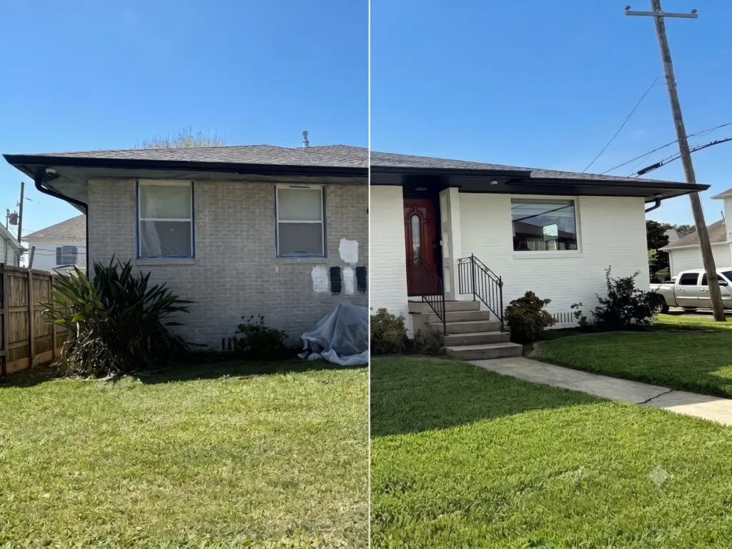
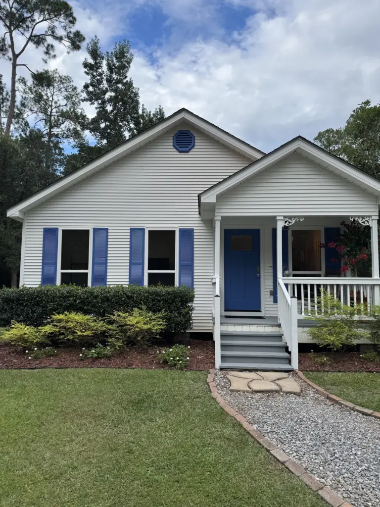
Then decide what deserves emphasis. A simple cottage often benefits from a restrained body color with a door or shutter color that provides depth. A more detailed façade can carry a calm body color and a carefully selected trim that helps the millwork read from the sidewalk. The best palette does not ask every detail to shout at once.
Let New Orleans light do part of the work
Paint samples can look surprisingly different outside. Warm sunlight can pull a neutral toward gold; shade under a porch can make the same color look cooler and deeper. Humidity, reflected greenery, surrounding brick, and a bright white neighboring house all influence what your eye sees.
Before committing, paint generous sample areas or use large sample boards. Check them in morning sun, midafternoon light, shade, and after rain. Move the sample beside the roof, brick, and porch floor. A color that seems subtle on a two-inch chip may feel much stronger across an entire façade.
Build the palette in layers
A useful exterior palette has jobs for each color. Think in layers rather than in a collection of favorites.
| Exterior element | What it should do | A practical starting point |
|---|---|---|
| Body | Establish the home’s overall mood | A muted green, blue, warm neutral, soft gray, or earthy hue |
| Trim | Define edges and architectural detail | A related lighter or darker neutral; avoid stark contrast by default |
| Shutters or door | Add focus and personality | A deeper version of the body color or one intentional accent |
| Porch ceiling | Soften a covered space | A pale blue-green or a light color related to the palette |
| Metalwork | Ground railings and hardware | Black, bronze, or another finish that coordinates with existing materials |
This approach gives you room for color without turning the exterior into a patchwork. For example, a soft olive body, warm off-white trim, near-black shutters, and a muted blue-green porch ceiling can feel layered and classic. A pale blue body with creamy trim and a deep red-brown door can feel equally grounded when it suits the home’s details.
Avoid treating pure white as the automatic trim solution. In New Orleans sun, bright white can appear sharp against aged brick or weathered wood. A warm white, putty, or pale gray may connect more naturally with the house.
Respect the house—and understand local review
“Historic” does not automatically mean “no color freedom,” but local rules are location- and scope-specific. It is especially important not to confuse the Historic District Landmarks Commission (HDLC) with the Vieux Carré Commission (VCC).
For properties under HDLC jurisdiction, the City says the commissions generally do not regulate the color of a building’s exterior paint. However, HDLC does regulate brick color, roofing-material color, and painting previously unpainted masonry; its staff can also help owners select colors appropriate to a building’s age and style. Read the City’s HDLC FAQ before assuming a project is routine.
The French Quarter has a different process. The City states that a VCC paint permit is required for outside painting on private property in the French Quarter, except for touch-ups, and that proposed colors must be approved. The application calls for photos and color information, including manufacturer, color name and number, and gloss level. Review the City’s VCC paint-permit page directly for the current requirements.
Rules and interpretations can change, and a property’s location and conditions matter. Confirm requirements directly with the appropriate City office before ordering paint or scheduling work. A painter can help you organize a color plan, but the homeowner should not rely on a blog post as permitting advice.
Three common color decisions worth slowing down for
1. Matching old color versus choosing a new direction
If a house has an existing color story you love, matching it may be the most coherent choice. If the current paint is faded, take samples from protected areas rather than judging only the sun-exposed façade. If you want a change, keep one visual anchor—such as a familiar shutter color, porch ceiling, or door tone—so the home still feels at home on its block.
2. Making trim too high-contrast
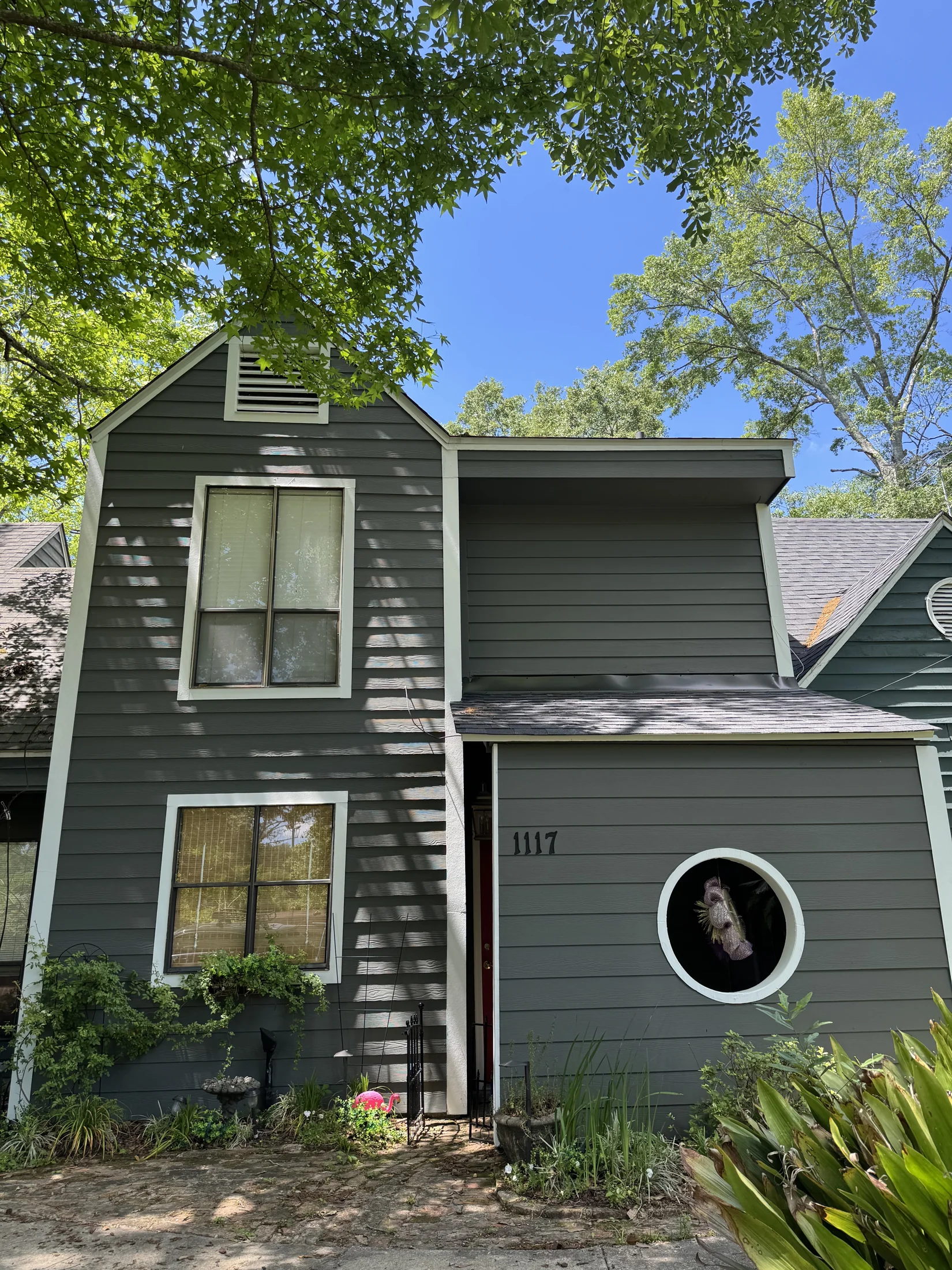
High contrast can be beautiful on the right house, but it can also make every uneven line more visible and make fine details look busy. Test a softened contrast first: cream against warm gray, charcoal against dusty blue, or deep olive against pale sage.
3. Choosing a door color in isolation
The front door is a natural place to be a little more expressive. Still, view it beside the body, trim, hardware, and porch light. A door color should feel like the last considered note in the palette—not a separate project.
What to ask your painter
Use the estimate conversation to turn a loose inspiration board into a paint plan:
- Which existing surfaces and colors should guide the palette?
- Can we view larger samples in the actual exterior light?
- Which sheen makes sense for the body, trim, doors, and shutters?
- What preparation does each surface need before painting?
- If the home is in a historic district, what information should we gather before confirming colors?
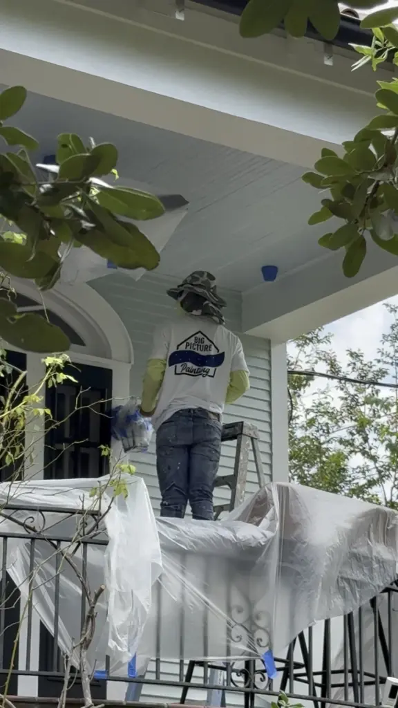
- How will the team protect landscaping, hardscape, and areas not being painted?
Those questions keep the decision practical. They also make it easier to compare estimates on more than a single bottom-line number.
A color plan that still feels like your home
The strongest historic New Orleans palettes are not museum displays. They are lived-in, considered, and responsive to the building. Give yourself permission to choose color—but use the house, the light, and any applicable review process as useful guardrails.
For help translating your ideas into a cohesive exterior palette, request a free in-person estimate from Big Picture Painting. We can walk the property with you, discuss the surfaces and color relationships, and help you plan the next step. request an estimate.